Indianapolis Indians Unveil New Looks
- Marc Viquez

- Sep 26, 2025
- 3 min read
Updated: Sep 29, 2025
Images courtesy of the Indianapolis Indians
The Indianapolis Indians will have a new look when they take the field in 2026. The ball club unveiled a new logo, uniforms, and caps Friday night. It marks the first time in 32 years that the club has made a change to its branding. The team has harkened back to a style that is reminiscent of images of the late 19th and early 20th centuries.
The following information comes from the club's official website.
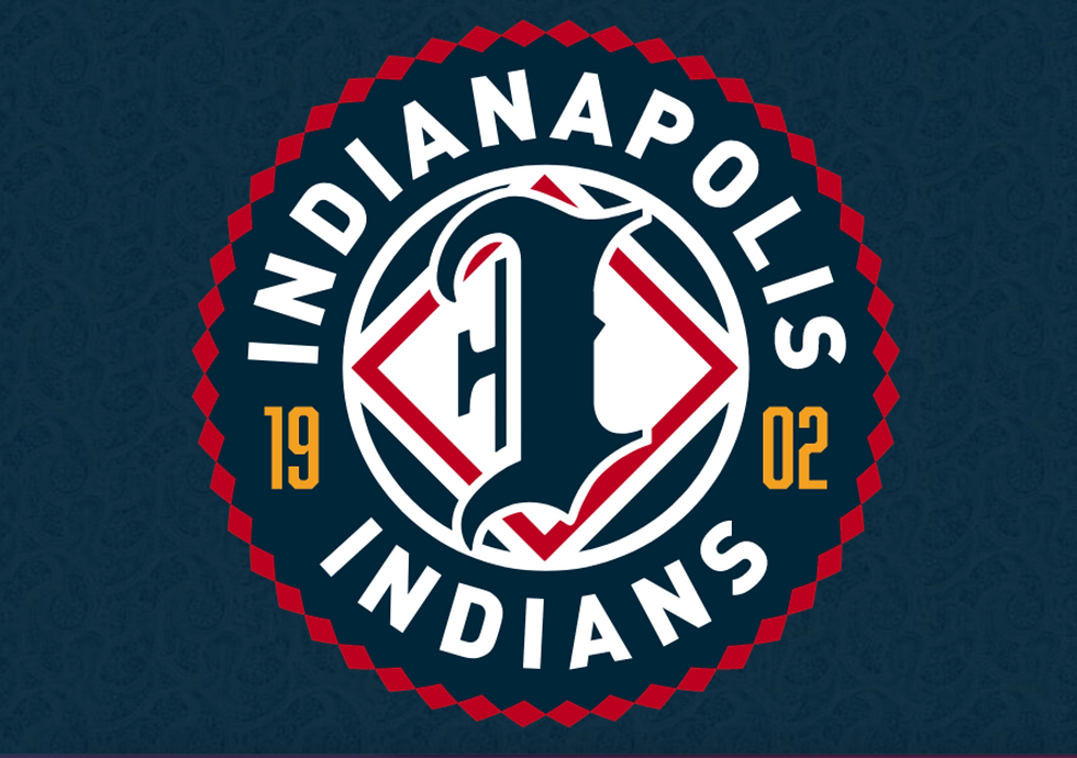
The primary logo combines a traditional blackletter “I” with a red diamond from the team’s 1920s logo, encircled by a border inspired by the ribbon work of the Miami Nation of Indians, who collaborated on the overall design. This new look honors the team’s long history in Indianapolis while representing local Indigenous culture.
Images courtesy of the Indianapolis Indians
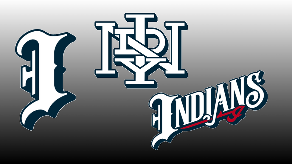
The club will be wearing one of two caps, including the “INDY” monogram that is rooted in tradition. The interlocker letters are reminiscent of vintage baseball caps, scorecards, and team emblems. It is designed to honor the club's past while offering a modern edge. The blackletter “I” pays homage to baseball designs of the late 19th and early 20th century.
The home and alternative uniforms feature a new wordmark that draws inspiration from the early 20th-century sports lettering, with ornate serifs and high-contrast strokes. According to the team website, the large, dramatic blackletter “I” anchors the composition, establishing gravitas and vintage authenticity. The away uniforms are simple with INDPLS in arched block letters, evoking looks from the 1950s and 1960s.

Images courtesy of the Indianapolis Indians
The team's new colors will include wrought iron blue, gold, sky blue, and cloud. The ball caps are solid blue for both home and away. The Indians will also release three new uniform collections: Circle City, Native American Heritage, and Negro Leagues.
According to the Indianapolis Star, the rebrand began in February 2023 when the team completed a year-long study on whether the franchise should keep the Indians name. They kept the name and partnered with the Miami Nation of Indians of Indiana.
The partnership includes a Miami scholarship program, fan educational opportunities about Native American history, and a land acknowledgement statement that is read before the start of every home game. You can see it in the main logo’s diamond motif border that it is drawn in inspiration from traditional Miami ribbon work patterns and shows a shared commitment to accurately representing the Indigenous culture.
The new branding was designed in-house by Adam Pintar, the team's senior director of brand, marketing, and communications. The old logo was patterned after Southwestern Native American imagery.
The rebrand is a bold move for the Indians, who have stayed consistent with the same branding since 1993. Frankly, it was time for a change. The team has an array of looks and retro styles from its days as the farm club of the Montreal Expos, Cincinnati Reds, and Cleveland Indians for more than two decades. The new branding is a distinct style all its own. The club scores points for its nod to early typography, approval from the Miami Nation of Indians, and a jersey that will honor the tribe.
The Indians will celebrate 30 years at Victory Field on July 11, 1996, and include the motto: "Indy Indians: New Look, Same Team."
------
Follow all of Marc’s stadium journeys on Twitter @ballparkhunter and his YouTube channel. Email at Marc.Viquez@stadiumjourney.com

